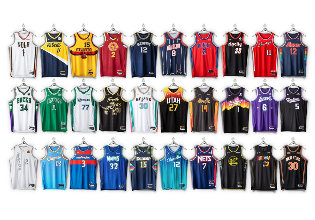
Look at all those beauts.
A great start to the week for all of us uniform analysts out there. The NBA dropped their 2021-2022 “City Edition” jerseys on Monday. One of our favorite traditions around here is being completely uninformed fashion critics. As we did last season, we are here once again to provide commentary that no one asks for or needs.
Cleveland Cavaliers – at time of writing, the Cavs have yet to post about their City Edition jerseys; simply shocking that an organization so well run would miss something like this. If you really want to get an idea, go watch Hoosiers.
Detroit Pistons – aren’t these pretty much just…their normal uniforms with the colors flipped? Only redeeming quality here is a that hint of Grant Hill era green/turquoise on the shorts.
Miami Heat – year in and year out, the Heat are at the top of any type of alternate uniform list, and nothing changes here. The ability to pull off all of the neon blues, pinks, etc. puts them at an unfair advantage. Excellent as usual.
Philadelphia 76ers – nice 70’s ABA vibe here. The multi-colored side panel gives off a little Nuggets/rainbow feature as well.
Phoenix Suns – the Suns haven’t posted about their City Edition jerseys at time of writing. But, it doesn’t appear they changed anything from last year. Those were perfect, so if it ain’t broke, don’t fix it.
Portland Trailblazers – not a huge stray away from their normal threads, but this still plays. How about the argyle-ish side panel, when was the last time we saw that on an NBA uniform?
Sacramento Kings – the lion logo is above par, the rest is fine. I’m going to use my joke from last year’s review (because it was so hilarious), I can see thousands of bros at Bonnaroo and Lollapalooza rocking these bad boys solely because is has “sac” on it, which is approval enough for me.
San Antonio Spurs – all in on these. Bright colors really work when teams try to think outside of the box on uniforms, and the Spurs’ color history works perfect for this.
Toronto Raptors – the Raptors kind of have a Magic/orange obsession with gold; very random. But you have to give some points here for the old school logo. A dinosaur dribbling a basketball, how absurd.
Utah Jazz – no social media post, and based on the picture above it doesn’t look like the Jazz put too much effort into their City Edition jerseys this year, sad!
Another year, another mediocre City Edition jersey review. This is a fun thing the NBA does every year, and while I’m sure they love the conversation and extra dollars that come with it, the misses are almost always as good as the hits.

[…] year! For the third consecutive season, the fashion department here at UDS has been called upon to make stupid jokes about the latest versions of the NBA “City Edition” jerseys. Let’s get right down […]
LikeLike
[…] is here and it’s spectacular. One of our favorite traditions since the 2020-2021 season, we dive deep into each jersey and provide the finest fashion commentary on the […]
LikeLike