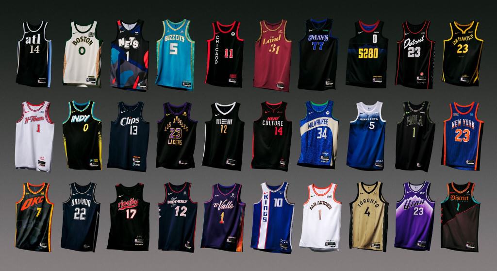
Chicago Bulls – a lot of empty surface area on the right side, a black hole signifying the current state of the franchise.
Cleveland Cavaliers x The Performing Arts 🎭
Presenting our 2023-24 Nike NBA City Edition uniform, inspired by our city’s rich history of performing arts from @playhousesquare, the largest Performing Arts Center in the United States outside of New York, to Severance Hall, home… pic.twitter.com/zG5WLGCq3U
Indiana Pacers – congratulations to the Pacers for breaking the color barrier; this tweet is exactly what Jackie Robinson fought for.
Los Angeles Clippers – after trading for James Harden, they’re using their City Edition jerseys to try and get Wizards Michael Jordan to also join the squad.
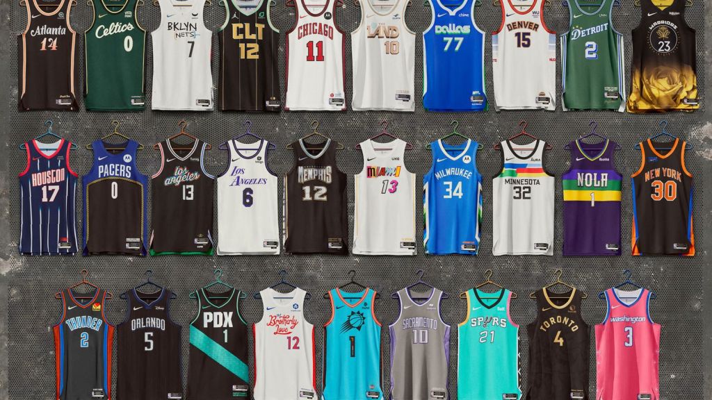
It’s that time of year! For the third consecutive season, the fashion department here at UDS has been called upon to make stupid jokes about the latest versions of the NBA “City Edition” jerseys. Let’s get right down to business.
Brooklyn Nets – just like last years, using the “Friends” font makes this jersey dumb…but there’s not much the Nets could’ve done that’s worse than what’s going on with that organization right now.
Oklahoma City Thunder – this poor organization has never done this well; so not much to expect here. Much like the Pistons, they should just do the Supersonics uniforms.
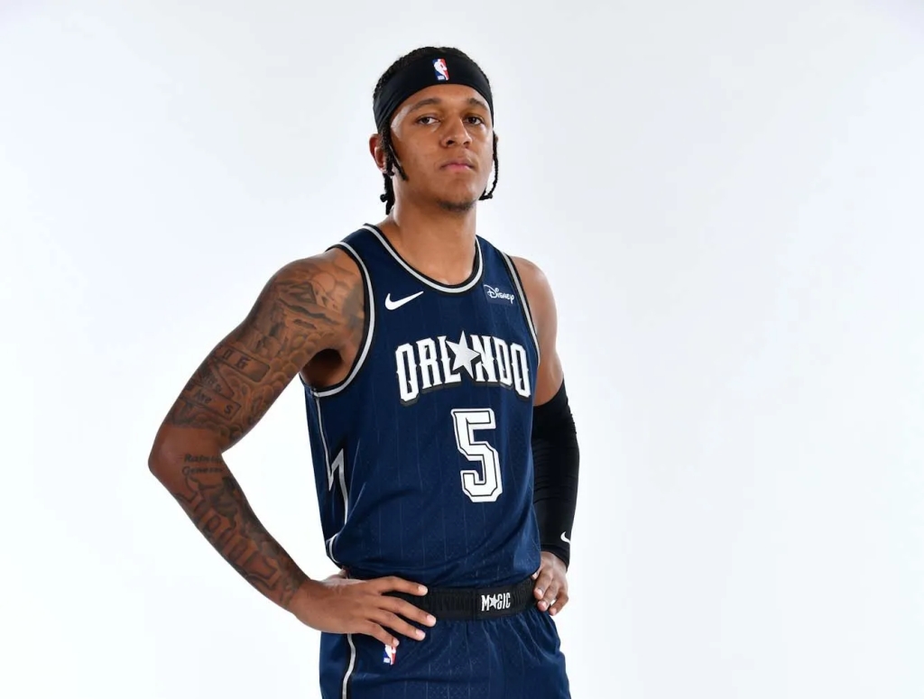
Orlando Magic – while these aren’t a huge jump from their normal ‘fits, the fact that they didn’t incorporate orange this year like they have in the past is a win.
Portland Trailblazers – these are like the away jerseys of the Suns jerseys, and should be included in the Spurs lawsuit. Big year for teal in the NBA.
Sacramento Kings 2022-23 Nike NBA City Editing Uniform – a tribute to Fans and City
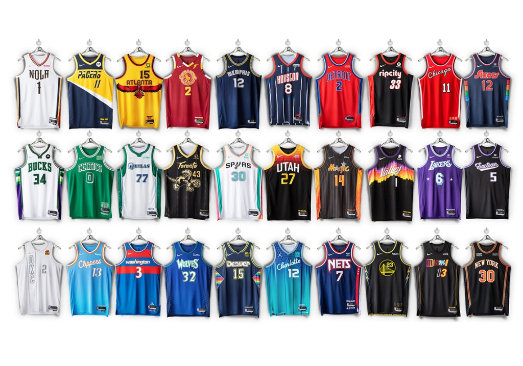
A great start to the week for all of us uniform analysts out there. The NBA dropped their 2021-2022 “City Edition” jerseys on Monday. One of our favorite traditions around here is being completely uninformed fashion critics. As we did last season, we are here once again to provide commentary that no one asks for or needs.
The 404 has always held us down. We bring you this jersey as our ultimate tribute to the 🅰️ pic.twitter.com/Lpxa9yzNlZ
Brooklyn Nets – always a good idea to throw back to the Jason Kidd/Richard Jefferson/Kenyon Martin era. Turns out the Nets Big 3 in the early aughts might end up being better than their current Big 3.
Chicago Bulls – the throwback font on “Chicago” is cool, but the basic number font doesn’t pair well, be better Bulls.
Cleveland Cavaliers – at time of writing, the Cavs have yet to post about their City Edition jerseys; simply shocking that an organization so well run would miss something like this. If you really want to get an idea, go watch Hoosiers.
Denver Nuggets – not only are these fun, but educational! I liked that Denver incorporated the ABA ball, and had no idea before today that their old logo was a miner. Also, the rainbow/mountain look always plays for the Nuggets in the uniform game.
Introducing… our #NBA75 City Edition jersey & uniform. Savvy and skilled, with grit and a never-back-down attitude, it’s a style of play that can only come from the Motor City. We hustle 𝒹𝒾𝒻𝒻𝑒𝓇𝑒𝓃𝓉.
Detroit Pistons – aren’t these pretty much just…their normal uniforms with the colors flipped? Only redeeming quality here is a that hint of Grant Hill era green/turquoise on the shorts.
Golden State Warriors – same vibes as the Pistons here for me. These are basically jerseys we’ve seen before, with one saving grace: the “splash” feature is awesome.
Houston Rockets – these are slick. I always liked the Barkley/Pippen/early Yoa Ming era Rockets jerseys, and it’s a nice touch incorporating that with their current logo on the shorts without it looking dumb.
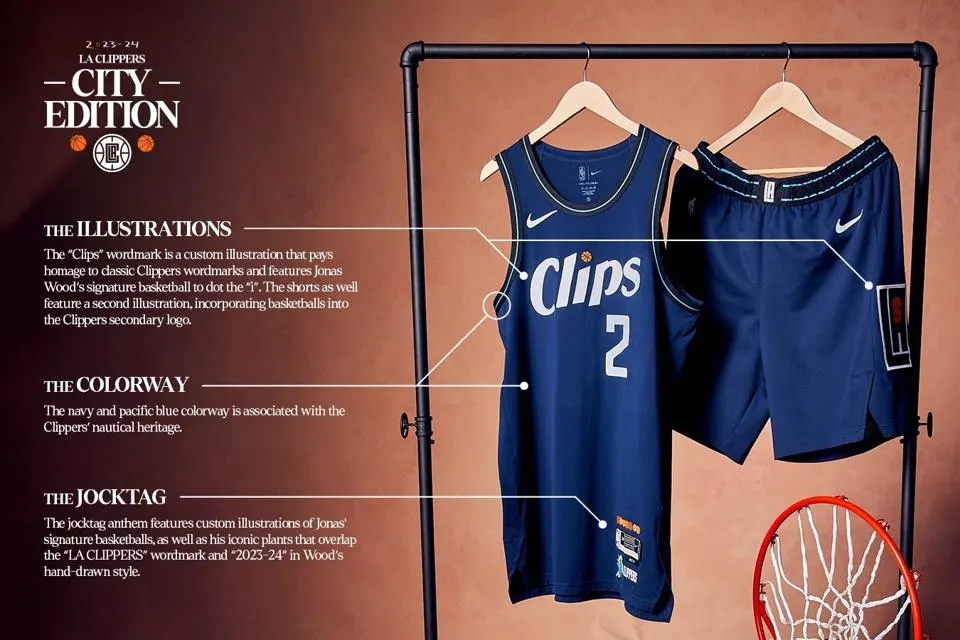
Los Angeles Clippers – wowzers these are clean. Nothing crazy, crisp letter & number font, great shade of baby blue. Not many wins for the Clips so far this year, but this is one.
Los Angeles Lakers – “lost” is an appropriate word the Lakers used in the above tweet. I get what they were going for here, but I think it’s a miss. If you’re one of the most storied franchises in NBA history and you City Edition jersey looks like the Charlotte Hornets Starter pullover jacket we all had in the 90’s, you missed.
Memphis Grizzlies – anytime you have the opportunity to lean into some of the greatest uniforms of all time, you need to take it. Opportunity squandered.
Miami Heat – year in and year out, the Heat are at the top of any type of alternate uniform list, and nothing changes here. The ability to pull off all of the neon blues, pinks, etc. puts them at an unfair advantage. Excellent as usual.
The City Edition makes its on-court debut November 17th at @FiservForum vs. LA.
Minnesota Timberwolves – Kevin Garnett would be proud, and so am I. Nice and easy look, the accent trees on the belt and shorts, with the throwback font as a cherry on top.
Philadelphia 76ers – nice 70’s ABA vibe here. The multi-colored side panel gives off a little Nuggets/rainbow feature as well.
Phoenix Suns – the Suns haven’t posted about their City Edition jerseys at time of writing. But, it doesn’t appear they changed anything from last year. Those were perfect, so if it ain’t broke, don’t fix it.
This year’s City edition honors three of the most iconic achievements in franchise history – the 1977 NBA Championship and the 1990 and 1992 Western Conference Championships.https://t.co/idNjRbJvjnpic.twitter.com/XJKkSuxC17
Portland Trailblazers – not a huge stray away from their normal threads, but this still plays. How about the argyle-ish side panel, when was the last time we saw that on an NBA uniform?
Sacramento Kings – the lion logo is above par, the rest is fine. I’m going to use my joke from last year’s review (because it was so hilarious), I can see thousands of bros at Bonnaroo and Lollapalooza rocking these bad boys solely because is has “sac” on it, which is approval enough for me.
San Antonio Spurs – all in on these. Bright colors really work when teams try to think outside of the box on uniforms, and the Spurs’ color history works perfect for this.
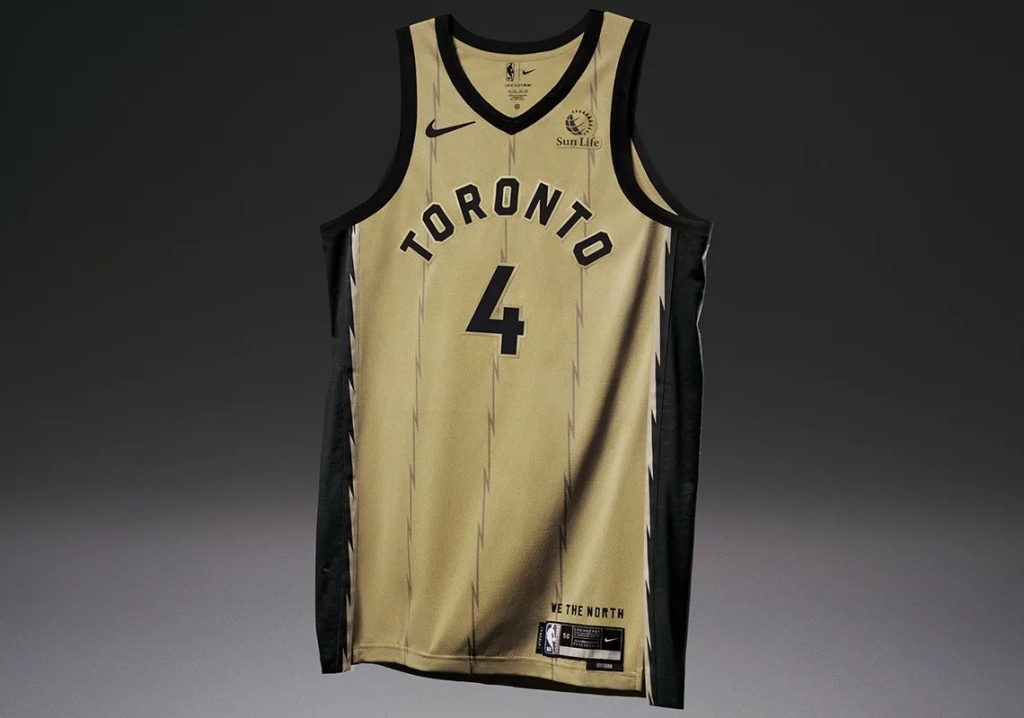
Toronto Raptors – the Raptors kind of have a Magic/orange obsession with gold; very random. But you have to give some points here for the old school logo. A dinosaur dribbling a basketball, how absurd.
Utah Jazz – no social media post, and based on the picture above it doesn’t look like the Jazz put too much effort into their City Edition jerseys this year, sad!
A mix of the old and the new.
Introducing our 2021-22 NBA City Edition uniform 🔥
Washington Wizards – ending with a winner here. Fairly basic design, love the font from the Washington B*llets days. Well done in our nation’s capital.
Another year, another mediocre City Edition jersey review. This is a fun thing the NBA does every year, and while I’m sure they love the conversation and extra dollars that come with it, the misses are almost always as good as the hits.
Hot start for hockey! Hašek was one of the greatest goaltenders to ever do it. His career spanned four decades (1980-2011), and included two Stanley Cups, two Hart Memorial trophies, and six Vezina trophies.
Demitra seemed to be on track to becoming one of the best Czech players in the game. He recorded 768 points in 847 games before sadly passing in a plane accident in 2011.
Bergeron has been a steady force for the Bruins since 2003. A part of the 2011 Stanley Cup winning team, Bergeron also made All-Star games in 2015 and 2016.
“The Bus” comes rumblin’, stumblin’, bumblin’ onto our list at 36. Bettis won a Super Bowl (in his home town of Detroit), was a two time first team All-Pro, and made six Pro Bowls.
An easy choice for what ended up being a stacked slot. Durant is potentially (based on how much you love/hate Lebron) currently the best basketball player on the planet. In a career with plenty of years left, Durant has already put together an incredible resume. The Slim Reaper has two NBA titles (Finals MVP in both), a regular season MVP, six first team All-NBA selections, and 11 All-Star appearances.
Honorable Mentions: Phil Niekro, Frank Thomas, Aeneas Williams, Tony Esposito
Another loaded number of selections here, but the most dominant big man of all time takes the cake. The Big Diesel’s career accolades are almost too much to list: four NBA championships, three NBA Finals MVPs, fifteen All-Star games, and eight first team All-NBA selections.
For as much good as Kareem has done off the court, he was as great on it. Six rings, a matching number of MVPs, 10 first team All-NBA selections, five first team All-Defensive teams, and lead the NBA in blocks in four separate seasons.
Honorable Mentions: Eddie Murray, Scottie Pippen, Zdeno Chára, Henrik Sedin, Dustin Byfuglien
Maddux is the second of the 90’s Braves big three to make the list, with Tom Glavine making the cut at 47. Mad Dog ended his 22 year career with 355 wins, 18 Gold Gloves, and four Cy Youngs.
Probably going to be our shortest career to make the list. Davis only played in the NFL from 1995-2001, but was good enough to make the Hall of Fame in 2017. In seven seasons, he racked up two Super Bowls, an MVP, and three first team All-Pro selections.
Honorable Mentions: Tim Raines, Martin Brodeur
The 30’s were by far our most expansive edition yet. Huge names and the honorable mention lists were incredible, specifically 32-35. One can only assume the list is going to keep improving into the 20’s.
Happy Mother’s Day! If you forgot to get your Mom anything, read her some poetry, which you can find below in this week’s SSM.
Bradley Beal dropped 50 on Indiana Didn’t need OT, game was bananas Wizards a shocking playoff team Getting hot at the right time, gaining steam
In the very same game, another triple double For Russell Westbrook, dude is trouble For anyone trying to shut him down He makes defenders look like clowns
Another big scorer, the man Steph Curry Forty-nine Saturday, racked ’em up in a hurry Put team on his back, and they won again Excited for the NBA playoffs to begin
NBA All-Star Sunday is our focus this week. We recap an enjoyable Sunday night, event by event, in this week’s SSM.
The premiere event in our basketball binge Was the Taco Bell sponsored Skills Challenge A long shot winner, Domantas Sabonis Dribbling, passing, shooting, guy could not miss
Next event up, the three point contest From behind the arc, let’s see who’s best Trey’s were falling, it was a tree point flurry An obvious winner here, the man, Steph Curry
The dunk contest was the halftime show We had Obi Toppin and two names you won’t know It was Anfernee Simons of Blazers fame Who won the contest, and cemented his name
Now the main event, Team Lebron vs. KD Alley oops, no defense, and plenty of three’s A glorified scrimmage, but it’s always fun 170-150 was the score, Team Lebron won
Another ASG in the books, a way different look Great job by the NBA, and all who partook A normal All-Star weekend next year, fingers crossed Without events like this, sports fans would be lost
We’re kicking off a new series; and we’re going by the numbers. This countdown is dedicated to the best players of all-time by each jersey number. No concrete formula here, just career stats, impact on the game, and some good old fashion opinion. Let’s hop right in.
He’s called “The Great One” for a reason. Hard to pick a favorite stat to demonstrate Gretzky’s dominance, but one of my favorites is that if he never scored a goal, he still would have had 11 straight 100-point seasons and won four scoring titles.
Honorable Mentions: Manny Ramirez, George Mikan, Warren Sapp
Not a widely popular number, so not our largest name on the list. Appropriately nicknamed “Big Snacks,” Hampton made five Pro Bowls as the Steelers nose tackle in the early aughts.
Anyone who goes undrafted in their respective sport and go on to become a Hall of Famer is good enough for this list. Randle made seven Pro Bowls and was a six time first team All-Pro selection en route to Canton.
“The Minister of Defense” was one of the greatest free agent signings of all time, when he left the Philadelphia Eagles in 1992 and signed with the Green Bay Packers. He finished his career with 198 sacks, two NFL defensive player of the year awards, and a Super Bowl ring.
Honorable Mentions: DeShawn Stevenson, Gabriel Landeskog
An obvious answer for a surprisingly strong number. But Rodman’s five rings, seven NBA All-Defensive first selections, and nearly 12,000 career rebounds puts him on our list.
Suh has had a late-career number change to 93, but he donned 90 early in his career for the Lions when he was arguable at his best. During his time rocking the big 9-0, Suh was the NFL Rookie of the Year, made four Pro Bowls, and was a three time NFL First Team All-Pro.
Honorable Mention: Ryan O’Reilly
High numbers, a lot of hockey players and defensive lineman, to be expected. Will we have some different sports and positions represented in our next set of jersey numbers, 89-80? Only time will tell.
The NBA is the the best in the big four sports at a lot of things. They by far and away have the best commissioner in Adam Silver, they lead the charge in the “bubble” phenomenon while getting their sport back on track during the pandemic, and have been for the most part the league least afraid to take stands on both social and political issues.
They also are not afraid to get weird with it when it comes to uniforms, which I respect. Don’t get me wrong, I love the traditional uniforms of Alabama football, Yankee baseball, etc. But getting out of your comfort zone is always a good thing, both in uniforms and in life. In recent years, the NBA has begun creating new uniforms for teams, calling them “City Edition” jerseys that are meant to show “team history and unique city stories.” The 2021 versions were fully released today, and boy are they something.
Atlanta Hawks – while the MLK tribute is awesome, this looks like a jersey from a low budget, late 90’s Disney movie about a team full of scrubs who pulled out all of the right tricks, and had juuuust the right amount of luck to upset the far superiorly talented rivals from across town.
Boston Celtics – an ode to the 17 championship banners hanging in TD Garden, this jersey is the aforementioned far superiorly talented rivals from across town that the Atlanta Hawks beat in the low budget late 90’s Disney movie.
Chicago Bulls – the Bulls slogan is “Touch the Clouds,” which is ironic because they haven’t touched anywhere higher than eighth place in the Eastern Conference in the past five years.
Dallas Mavericks – hard to find much wrong with these, besides the fact that one of the NBA’s best players, Luka Dončić, wears number 77. Get the hell out of here and give the man a real number.
Detroit Pistons – very fitting slogan here, “Tough Together,” Pistons fans have had to watch some tough looking basketball together for the last decade or so.
Golden State Warriors – hard to argue with this one, paying tribute to Oakland after moving into their new arena in San Francisco. Like most things The Warriors have done since they drafted Steph Curry, this was done right.
Los Angeles Clippers – these are pretty much identical to the Clippers 2019-2020 “City Edition” jerseys, so bonus points for fresh creativity. Bonus points for making me want to play Grand Theft Auto: San Andreas when I see the font.
Memphis Grizzlies – these are solid, but I wish they would’ve just went for it with the old Vancouver Grizzlies uniforms, which are just gorgeous and remind me of another one of my favorite old players, Bryant “Big Country” Reeves.
Miami Heat – this is the perfect city/team for something like “City Edition” jerseys. Miami can do anything with any neon pink, blue, orange, etc. and make it look great. A very solid, wavy effort here.
Milwaukee Bucks – does anyone really associate Milwaukee with the Great Lakes? I don’t, but can only assume this is what Giannis Antetokounmpo wanted, and The Bucks continue to do whatever they can to keep him happy and in Milwaukee.
Minnesota Timberwolves – this is just generally boring. Also the slogan “The North Star That Guides & Unites” is pretty great for a organization that has seemingly no direction at this point.
New Orleans Pelicans – an ambitious stab here, although I think it came out looking more like what I would have came up with for uniforms of my “Create A Team” in NBA Live 2002. You know, the one with Steve Francis on the cover.
Orlando Magic – Orlando has messed around with incorporating orange into their uniforms in last years “City Edition,” and I just don’t get it. They have a great color scheme, and should use it here.
Sacramento Kings – I can see thousands of bros at Bonnaroo and Lollapalooza rocking these bad boys solely because is has “sac” on it, which is approval enough for me.
San Antonio Spurs – very smooth. Slick font, crisp lines across the chest. I’m all in here.
ROAM THE NORTH@Raptors City Edition jerseys are launching in March 2021. Shop the rest of the Raptors City Edition Collection today ➡️ https://t.co/NyoY8DuBlr
🗓️ NBA Season Starts Christmas Week with Games Beginning Tuesday, December 22. pic.twitter.com/f5iIlW1NSy
Toronto Raptors – from a team that’s going to be playing in Tampa Bay next year, missed opportunity to double up on your sales by throwing “Tampa Bay” and “Toronto” across the chest. Those friendly Canadians are too nice to make people pay twice though, eh?
Washington Wizards – ending our recap here with a banger. These are great, from the throwback logo to the flag pattern moving down the sides. This is the best thing the Wizards franchise has done in a while.
Even though it seems like the NBA season ended last week, it will be back on Christmas Day. Bring on The Association and all of the great, and not so great, “City Edition” jerseys that come with it.


