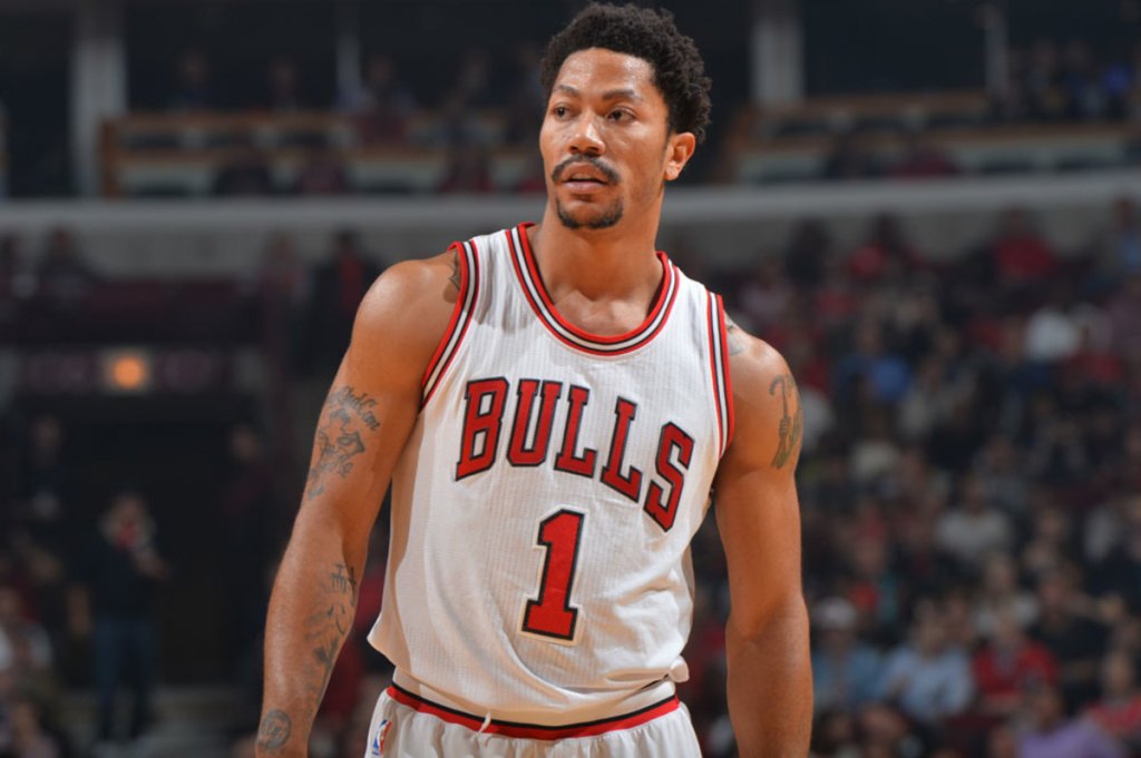
Derrick Rose announced his retirement today. The youngest MVP in NBA history has called it a career after 15 seasons with the Bulls, Knicks, Cavaliers, Timberwolves, Pistons, and Grizzlies.
The only thing that may have surpassed his athleticism is his name. But does he have the best botanical name in sports? Let’s dig in.
Basil McRae – played 18 seasons in the NHL, recording 52 goals and 83 assists.
Bud Adams – former owner of the Tennessee Titans.
Jasmine Jones – fourth place finisher in the 2024 Olympic 400 meter hurdles.
Ted Lilly – won 130 games, career ERA of 4.14.
Clover – the 2024 NBA champion Boston Celtics.
The Masters Azaleas – beautiful.
Pretty clear cut here. The seeds of interest have lead us down this interesting road, but our opinion here is pretty deep rooted. Derrick Rose is one of the greatest “what ifs” stories in sports, but we won’t make this blog too sappy. So, we wish a happy retirement to Pooh.
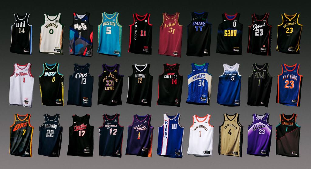
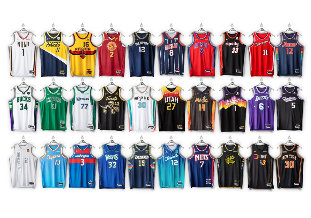
Chicago Bulls – a lot of empty surface area on the right side, a black hole signifying the current state of the franchise.
Cleveland Cavaliers x The Performing Arts 🎭
Presenting our 2023-24 Nike NBA City Edition uniform, inspired by our city’s rich history of performing arts from @playhousesquare, the largest Performing Arts Center in the United States outside of New York, to Severance Hall, home… pic.twitter.com/zG5WLGCq3U
Indiana Pacers – congratulations to the Pacers for breaking the color barrier; this tweet is exactly what Jackie Robinson fought for.
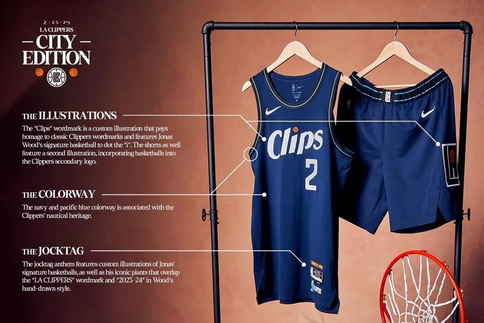
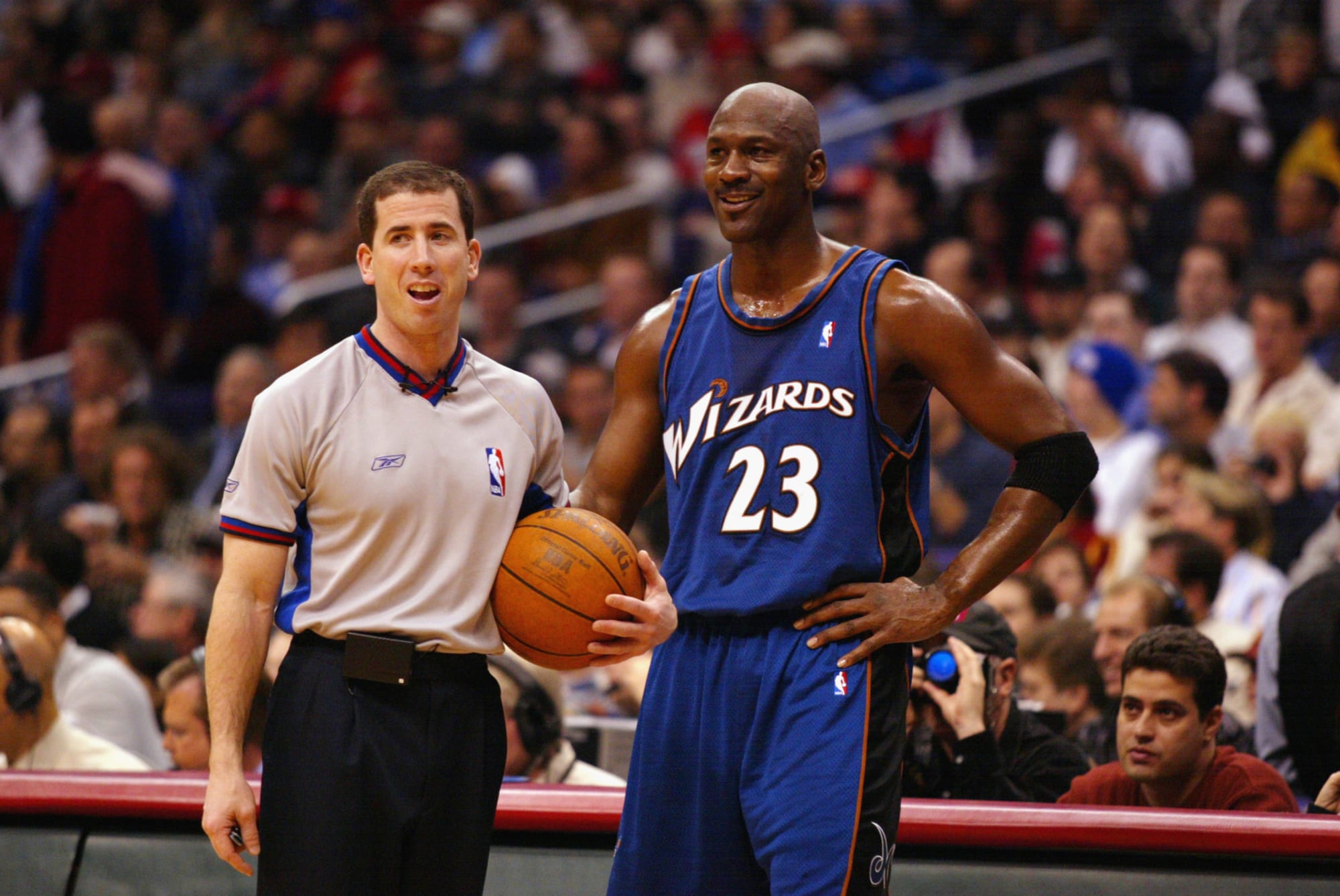
Los Angeles Clippers – after trading for James Harden, they’re using their City Edition jerseys to try and get Wizards Michael Jordan to also join the squad.
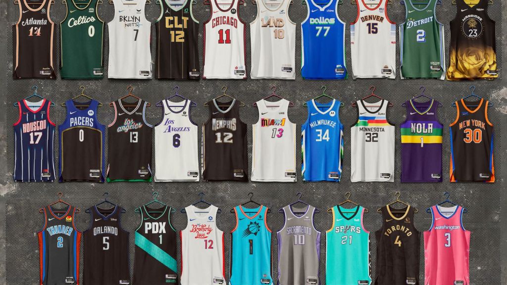
It’s that time of year! For the third consecutive season, the fashion department here at UDS has been called upon to make stupid jokes about the latest versions of the NBA “City Edition” jerseys. Let’s get right down to business.
Brooklyn Nets – just like last years, using the “Friends” font makes this jersey dumb…but there’s not much the Nets could’ve done that’s worse than what’s going on with that organization right now.
Oklahoma City Thunder – this poor organization has never done this well; so not much to expect here. Much like the Pistons, they should just do the Supersonics uniforms.
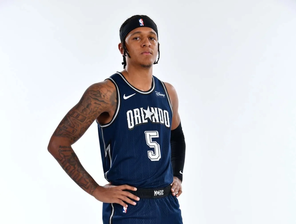
Orlando Magic – while these aren’t a huge jump from their normal ‘fits, the fact that they didn’t incorporate orange this year like they have in the past is a win.
Portland Trailblazers – these are like the away jerseys of the Suns jerseys, and should be included in the Spurs lawsuit. Big year for teal in the NBA.
Sacramento Kings 2022-23 Nike NBA City Editing Uniform – a tribute to Fans and City
Another week come and gone, another Sunday State of Mind.
An always touching tribute, a statue was revealed This week in Oklahoma this one should have stayed concealed Poor Baker Mayfield, guy can’t catch a break If I were him that statue would have ended up in a lake
Big loss in Chicago, Eloy Jimenez Out for up to two months, so the doctor says Add another name to the White Sox injury list Tough break for a good team, that bat will be missed
A happier baseball note, it’s Miguel Cabrera Joined the 3k hit club, maybe the last in this era Only 32 other players have reached that career mark Miggy one of the greatest to do it at the ballpark
NBA playoffs are here, and some teams are in trouble Raptors, Bulls, Nets and Nuggets are all on the bubble Mavs and Jazz, Grizz and Wolves both sitting at 2-2 We get action everyday as the games continue
If you’ve ever read this blog, you know we love NASCAR Driving for 500 miles but not going far The most famous track in all of motor sports The Talladega Speedway, running today of course
We are in full blown holiday season, and the gift of sports keeps on giving. We recap the past seven days of presents in this week’s SSM.
NFL afternoon slate, full of overtime Bucs and Bills, Niners and Bengals, teams all in their prime San Francisco, Tampa Bay, both teams with the dubs All four teams might make the playoffs, none of them are scrubs
Another great week in Jacksonville For Urban Meyer, dude is not chill He called his staff losers, things not going well Looking to move to Florida? Urban may be ready to sell
Big COVID outbreak for the Chicago Bulls Nine players in quarantine, protocol list is full Hard to keep momentum going with a thing like this Hopefully all get well soon or Bulls fans will be pissed
A great start to the week for all of us uniform analysts out there. The NBA dropped their 2021-2022 “City Edition” jerseys on Monday. One of our favorite traditions around here is being completely uninformed fashion critics. As we did last season, we are here once again to provide commentary that no one asks for or needs.
The 404 has always held us down. We bring you this jersey as our ultimate tribute to the 🅰️ pic.twitter.com/Lpxa9yzNlZ
Brooklyn Nets – always a good idea to throw back to the Jason Kidd/Richard Jefferson/Kenyon Martin era. Turns out the Nets Big 3 in the early aughts might end up being better than their current Big 3.
Chicago Bulls – the throwback font on “Chicago” is cool, but the basic number font doesn’t pair well, be better Bulls.
Cleveland Cavaliers – at time of writing, the Cavs have yet to post about their City Edition jerseys; simply shocking that an organization so well run would miss something like this. If you really want to get an idea, go watch Hoosiers.
Denver Nuggets – not only are these fun, but educational! I liked that Denver incorporated the ABA ball, and had no idea before today that their old logo was a miner. Also, the rainbow/mountain look always plays for the Nuggets in the uniform game.
Introducing… our #NBA75 City Edition jersey & uniform. Savvy and skilled, with grit and a never-back-down attitude, it’s a style of play that can only come from the Motor City. We hustle 𝒹𝒾𝒻𝒻𝑒𝓇𝑒𝓃𝓉.
Detroit Pistons – aren’t these pretty much just…their normal uniforms with the colors flipped? Only redeeming quality here is a that hint of Grant Hill era green/turquoise on the shorts.
Golden State Warriors – same vibes as the Pistons here for me. These are basically jerseys we’ve seen before, with one saving grace: the “splash” feature is awesome.
Houston Rockets – these are slick. I always liked the Barkley/Pippen/early Yoa Ming era Rockets jerseys, and it’s a nice touch incorporating that with their current logo on the shorts without it looking dumb.
Los Angeles Clippers – wowzers these are clean. Nothing crazy, crisp letter & number font, great shade of baby blue. Not many wins for the Clips so far this year, but this is one.
Los Angeles Lakers – “lost” is an appropriate word the Lakers used in the above tweet. I get what they were going for here, but I think it’s a miss. If you’re one of the most storied franchises in NBA history and you City Edition jersey looks like the Charlotte Hornets Starter pullover jacket we all had in the 90’s, you missed.
Memphis Grizzlies – anytime you have the opportunity to lean into some of the greatest uniforms of all time, you need to take it. Opportunity squandered.
Miami Heat – year in and year out, the Heat are at the top of any type of alternate uniform list, and nothing changes here. The ability to pull off all of the neon blues, pinks, etc. puts them at an unfair advantage. Excellent as usual.
The City Edition makes its on-court debut November 17th at @FiservForum vs. LA.
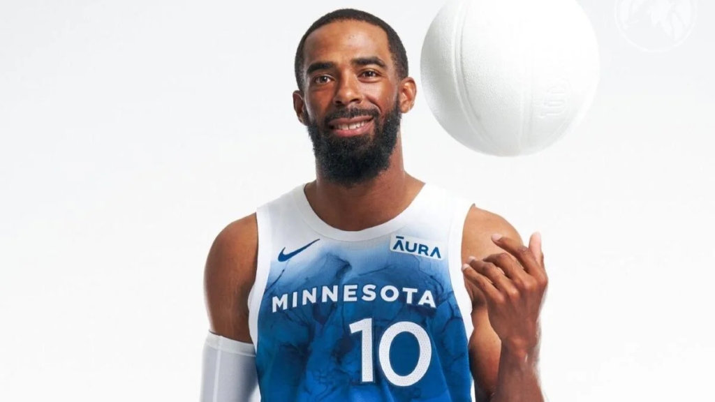
Minnesota Timberwolves – Kevin Garnett would be proud, and so am I. Nice and easy look, the accent trees on the belt and shorts, with the throwback font as a cherry on top.
Philadelphia 76ers – nice 70’s ABA vibe here. The multi-colored side panel gives off a little Nuggets/rainbow feature as well.
Phoenix Suns – the Suns haven’t posted about their City Edition jerseys at time of writing. But, it doesn’t appear they changed anything from last year. Those were perfect, so if it ain’t broke, don’t fix it.
This year’s City edition honors three of the most iconic achievements in franchise history – the 1977 NBA Championship and the 1990 and 1992 Western Conference Championships.https://t.co/idNjRbJvjnpic.twitter.com/XJKkSuxC17
Portland Trailblazers – not a huge stray away from their normal threads, but this still plays. How about the argyle-ish side panel, when was the last time we saw that on an NBA uniform?
Sacramento Kings – the lion logo is above par, the rest is fine. I’m going to use my joke from last year’s review (because it was so hilarious), I can see thousands of bros at Bonnaroo and Lollapalooza rocking these bad boys solely because is has “sac” on it, which is approval enough for me.
San Antonio Spurs – all in on these. Bright colors really work when teams try to think outside of the box on uniforms, and the Spurs’ color history works perfect for this.
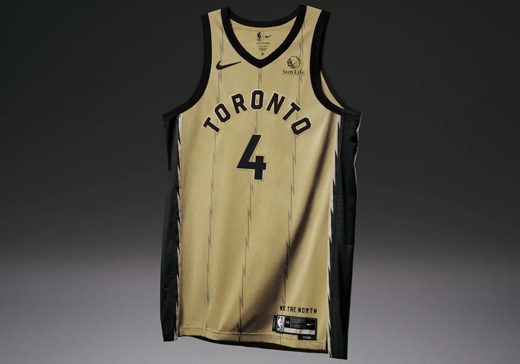
Toronto Raptors – the Raptors kind of have a Magic/orange obsession with gold; very random. But you have to give some points here for the old school logo. A dinosaur dribbling a basketball, how absurd.
Utah Jazz – no social media post, and based on the picture above it doesn’t look like the Jazz put too much effort into their City Edition jerseys this year, sad!
A mix of the old and the new.
Introducing our 2021-22 NBA City Edition uniform 🔥
Washington Wizards – ending with a winner here. Fairly basic design, love the font from the Washington B*llets days. Well done in our nation’s capital.
Another year, another mediocre City Edition jersey review. This is a fun thing the NBA does every year, and while I’m sure they love the conversation and extra dollars that come with it, the misses are almost always as good as the hits.
A spooky, after dark edition of SSM this week. We take a scary hayrack ride through the week that was in the sports world. Those scrappy bad guy Astros, just keep hangin’ ’round The Braves could have been World Series champs, no king yet has been crowned Atlanta still up 3-2, one more win on the way? They’ll get a chance to become champs this coming Tuesday
The Jets have won a game! What a New Jersey dream Even more impressive, they beat a first place team Tough loss for the Bengals, hopefully a minor stop In what would be a great season while rising to the top
Sticking in the AFC East, but opposite result Dolphins lose their seventh straight, total football insult The Bills bounce back for a win, after a Monday loss Come playoff time, Bills Mafia will not be crossed
The NBA is in full swing, the sports world has no lulls The Eastern Conference has been surprising: Knicks, Hornets, and Bulls Out in the Western Conference, Clippers are 1-4 Hope it will get better, a start the Clips ignore
Got an in state battle, down in East Lansing Sparty came out, beat big brother, totally did their thing A tough loss for Michigan, but they’re still top 10 Another ranked opponent beating Jim Harbaugh again
A really tough two weeks for Iowa football Number two two weeks ago, since then been all fall After losing to Wisconsin, another unranked foe Hawkeyes fall to number 19, there their playoff dreams go
Caleb Williams and the Sooners, rolled up Texas Tech Six touchdowns through the air, Red Raiders saying “what the heck?” Incredible start to a career, the young man is a battler Continues to be special and play over Spencer Rattler
Joakim Noah, the Bulls newest ambassador and one of the NBA’s most interesting men on and off the court, will be properly honored Thursday night in Chicago. The son of a professional tennis player and Miss Universe contestant will get his due at The United Center for his efforts and contributions during his 13 years in the NBA. The Knicks come to town to play the Bulls in a matchup of two of Noah’s former teams for “Joakim Noah Night.”
The Bulls put together a great (long) thank you video outlining what Noah meant during and after his time with the organization.
For anyone who appreciated the Noah/Rose/Boozer/Thibodeau era of Chicago basketball, this whole week has been a nostalgic blur. The Bulls Twitter account has been full of content and pictures that will bring any fan back to an incredible time.
Here at UDS, we would like to join the party in heaping praise on Joakim. Some of his greatest career highlights (in our opinion) are below.
Draft Day
One of the GOAT pictures in NBA, if not all of history.
Where do we even start?
Every single aspect of this picture brings joy. The tan pinstripe suit, the draft day hat barely containing the glorious hair, the gap-toothed infectious smile, the oversized bow tie.
The overall complete contrast next to David Stern makes Noah’s draft day picture one of the greatest of all time.
After his time in Chicago, Noah signed with the Knicks in 2016.
An unfortunately unsuccessful tenure that only lasted three injury-filled seasons.
In an interview with Chris Vernon, Noah admitted: “I can look back at it and say I was ready for New York City…[b]ut I wasn’t. Not just the pressure. I remember after the first game I had 60 people in my house. I’m too lit to play in New York City.”
The blunt honesty is something so rare we get as fans, and Noah should be applauded for being so sincere on such a public failure.
So Jo, Sticks, Mr. Noah, Stickity, and any other loving name we can use, thank you. Your energy, openness, and general vibe made you one of the most entertaining players the NBA has had in its history.
We’ve arrived at an incredibly important edition of “Who Wore It Best.” In our latest, we’re digging into the roaring 20’s. Let’s find out together who made the cut in this extremely paramount, career-defining list.
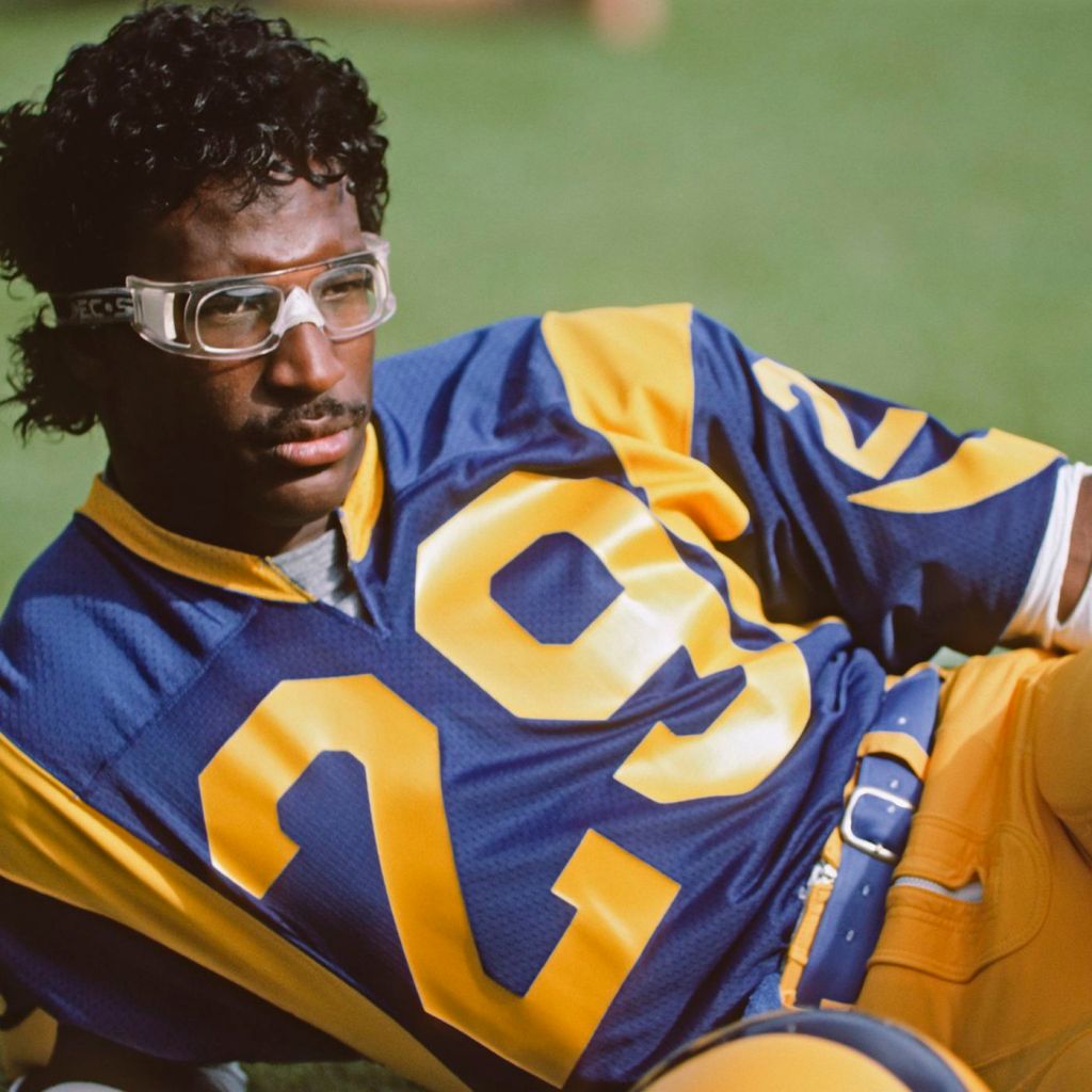
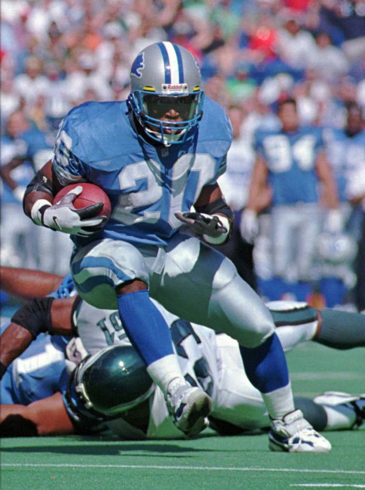
His athletic excellence barely surpassed that of the rec specs. Dickerson put together the greatest single season rushing the football in 1984, going for an NFL record 2,105 yards. He wasn’t just a one season wonder, however. Before being inducted into the Pro Football Hall of Fame in 1999, Dickerson was a five time first team All-Pro, four time rushing leader, has his number 29 retired by the LA Rams, and is in the Indianapolis Colts Ring of Honor.
Honorable Mentions: Adrian Beltre, Ken Dryden, Marc-André Fleury
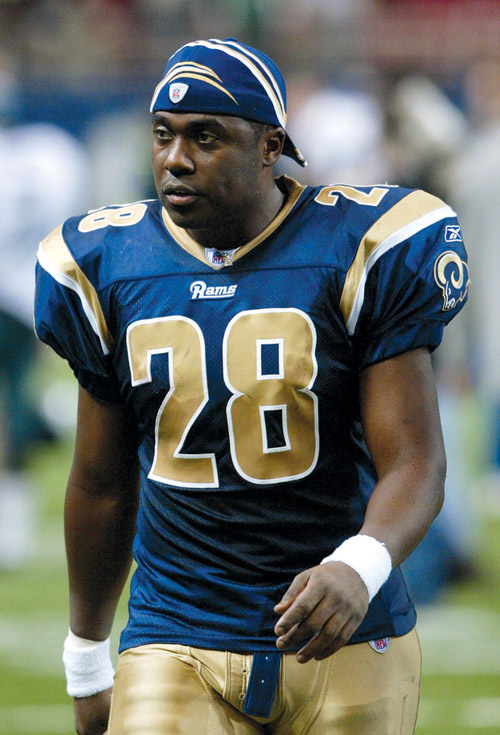
Back to back running backs who played for the Rams and Colts. Much like Dickerson, Faulk both has his number retired by the Rams as well as being a member of the Colts Ring of Honor. Unlike Dickerson, Faulk has a Super Bowl ring. He also tacked on a MVP, three offensive player of the year awards, as well as three first team All-Pro selections.
Honorable Mentions: Bert Blyleven, Curtis Martin, Darrell Green
Vlad the Impaler was a 2018 Hall of Fame inductee. He earned his spot in Cooperstown after winning the 2004 MVP, hitting 449 career home runs while maintaining a .318 career batting average, and winning an incredible eight Silver Slugger awards.
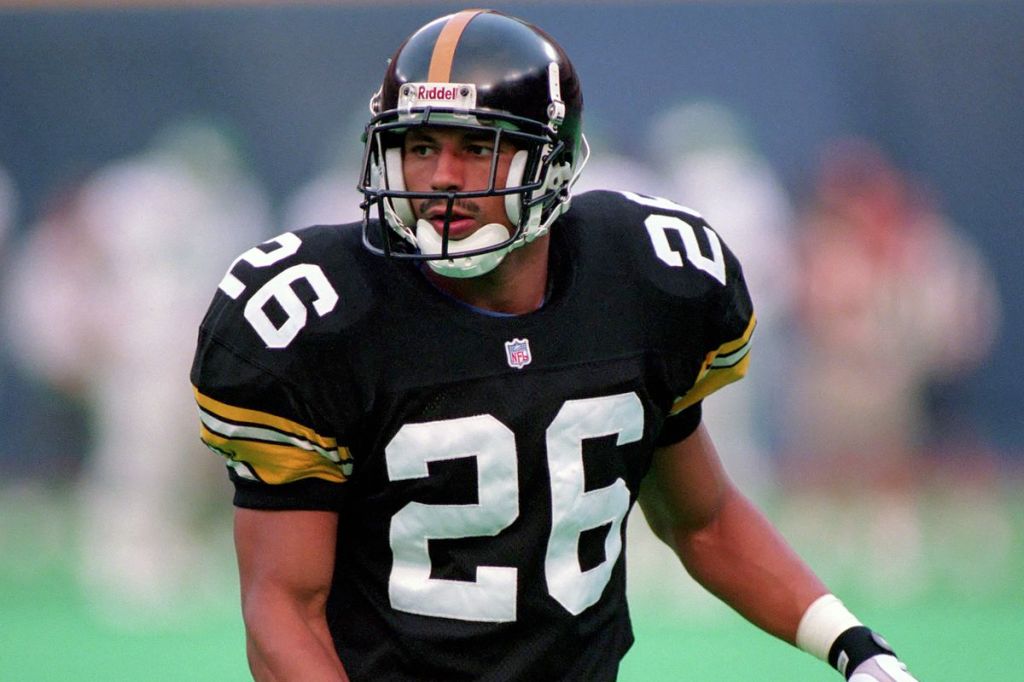
Rod Woodson was one of the best ball hawks to ever do it; picking off 71 balls in his 17 NFL seasons. He was also a vital member of one of the greatest defenses of all time, the Super Bowl XXXV champion Baltimore Ravens. All of this (and more) cumulated in an induction to the Pro Football Hall of Fame in 2009.
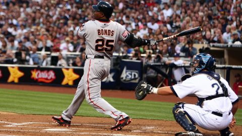
Even before he went to the Giants and things…changed; Barry Bonds was one of the greatest players in baseball. In his seven seasons in Pittsburgh before moving to San Francisco, Bonds was a three time NL MVP, won five Gold Gloves, and five Silver Slugger awards.
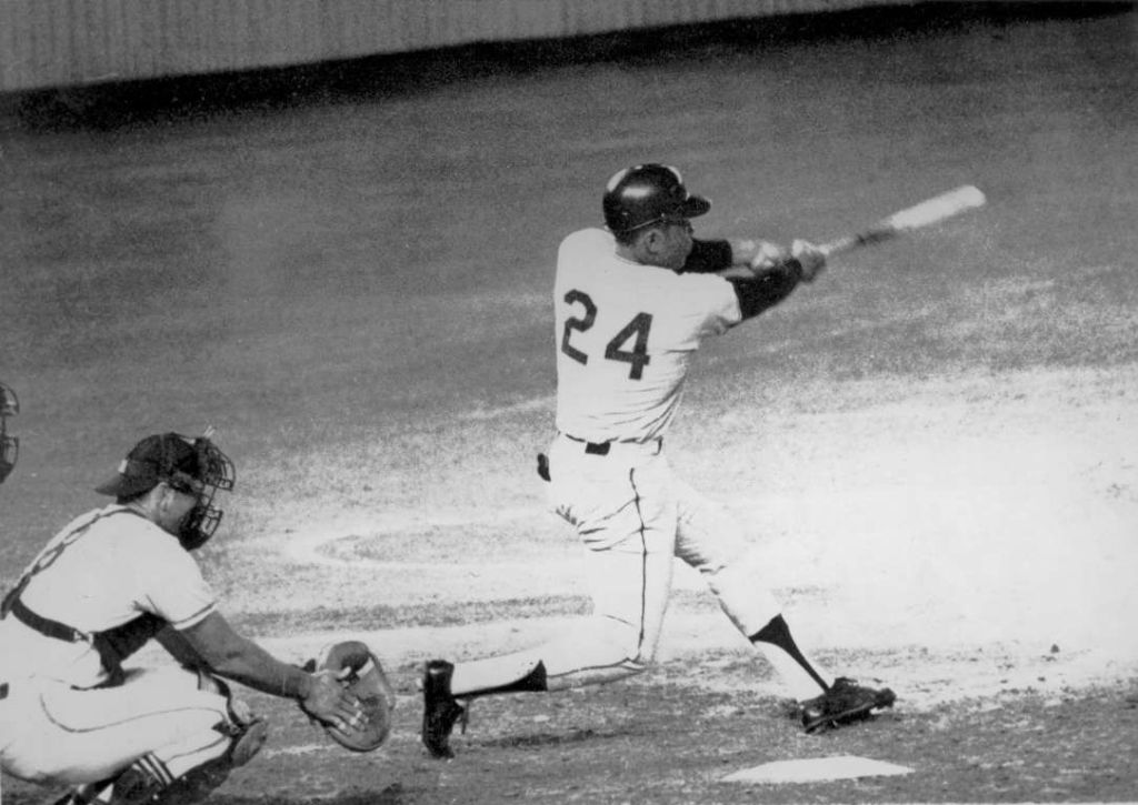
Absolute stacked number here, but Mays takes the cake. The stats are gawdy; 660 home runs, 1,903 RBI, and 338 stolen bases. Along the way Mays made 24 All-Star games, won twelve Gold Gloves, two NL MVPs, and a World Series in 1954.
Honorable Mentions: Ken Griffey Jr., Rickey Henderson, Miguel Cabrera, Manny Ramirez, Rick Barry, Champ Bailey, Chris Chelios
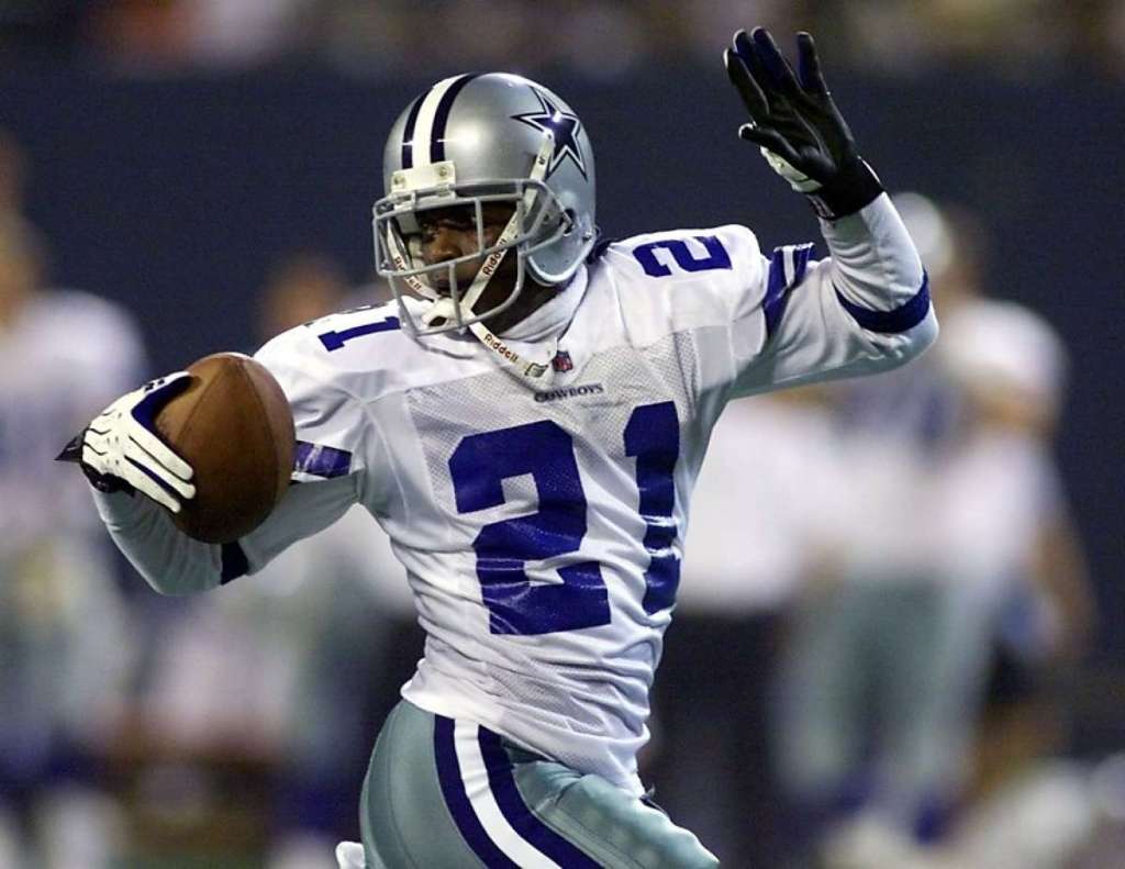
Emmitt Smith did it all in his 15 NFL seasons. The league’s all time leading rusher (18,355 yards) won three Super Bowls, the 1993 NFL MVP, was a four time first team All-Pro, and lead the NFL in touchdowns three separate seasons.
Honorable Mentions: Clayton Kershaw, Elgin Baylor, Roger Clemens
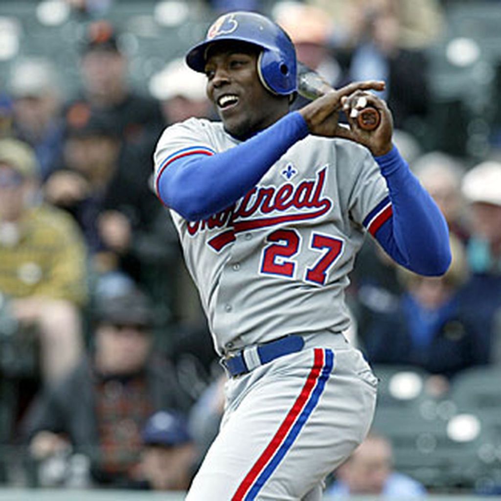
The swagiest swag that ever swagged. Deion was, and still is, one of the most raw athletes we’ve ever seen. He wasn’t too bad on the field either. Prime’s got two Super Bowl rings, six first team All-Pro selections, and is a member of both the 90’s All-Decade and NFL 100th Anniversary Teams. Oh, and he also played in the MLB for nine seasons. He was a .263 career hitter, with 39 home runs, 168 RBI, and 186 stolen bases. Absolute baller.
Honorable Mentions: Roberto Clemente, Tim Duncan, Kevin Garnett, LaDainian Tomlinson, Stan Mikita, Peter Forsberg
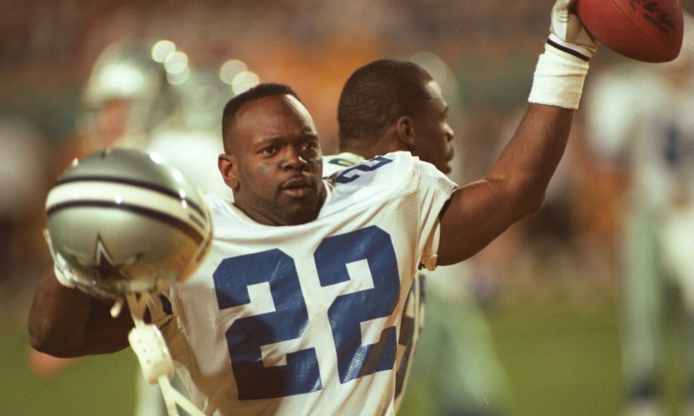
The twitchiest running back we’ve ever seen, just absolutely stupid stuff. A combo Heisman winner and NFL MVP, the four time first team All-Pro ran for over 15,000 yards and almost 100 touchdowns. Pretty good for a guy who retired early.
Honorable Mentions: Frank Robinson, Mike Schmidt, Gary Payton, Ed Reed, Brian Dawkins
The numbers get lower, and the lists get better. How about 24 and 21 just absolutely cleaning house? All four major sports represented on each. This was a great edition of “Who Wore It Best,” and we can only assume the names will get hotter the next time around.
Hot start for hockey! Hašek was one of the greatest goaltenders to ever do it. His career spanned four decades (1980-2011), and included two Stanley Cups, two Hart Memorial trophies, and six Vezina trophies.
Demitra seemed to be on track to becoming one of the best Czech players in the game. He recorded 768 points in 847 games before sadly passing in a plane accident in 2011.
Bergeron has been a steady force for the Bruins since 2003. A part of the 2011 Stanley Cup winning team, Bergeron also made All-Star games in 2015 and 2016.
“The Bus” comes rumblin’, stumblin’, bumblin’ onto our list at 36. Bettis won a Super Bowl (in his home town of Detroit), was a two time first team All-Pro, and made six Pro Bowls.
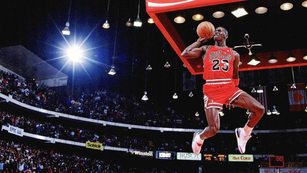
An easy choice for what ended up being a stacked slot. Durant is potentially (based on how much you love/hate Lebron) currently the best basketball player on the planet. In a career with plenty of years left, Durant has already put together an incredible resume. The Slim Reaper has two NBA titles (Finals MVP in both), a regular season MVP, six first team All-NBA selections, and 11 All-Star appearances.
Honorable Mentions: Phil Niekro, Frank Thomas, Aeneas Williams, Tony Esposito
Another loaded number of selections here, but the most dominant big man of all time takes the cake. The Big Diesel’s career accolades are almost too much to list: four NBA championships, three NBA Finals MVPs, fifteen All-Star games, and eight first team All-NBA selections.
For as much good as Kareem has done off the court, he was as great on it. Six rings, a matching number of MVPs, 10 first team All-NBA selections, five first team All-Defensive teams, and lead the NBA in blocks in four separate seasons.
Honorable Mentions: Eddie Murray, Scottie Pippen, Zdeno Chára, Henrik Sedin, Dustin Byfuglien
Maddux is the second of the 90’s Braves big three to make the list, with Tom Glavine making the cut at 47. Mad Dog ended his 22 year career with 355 wins, 18 Gold Gloves, and four Cy Youngs.
Probably going to be our shortest career to make the list. Davis only played in the NFL from 1995-2001, but was good enough to make the Hall of Fame in 2017. In seven seasons, he racked up two Super Bowls, an MVP, and three first team All-Pro selections.
Honorable Mentions: Tim Raines, Martin Brodeur
The 30’s were by far our most expansive edition yet. Huge names and the honorable mention lists were incredible, specifically 32-35. One can only assume the list is going to keep improving into the 20’s.


